What were we solving for?
Business goals: To raise the conversion rate and test inline shoppability for customers who have entered through the home page.
Traffic was unexpectedly high for web: 50% of users complete their purchases via desktop web, with 62% of users selecting home page editorially-driven promos.
User goals: To discover editorial content and product recommendations to each user’s individual brand, category, size, price and stylistic preferences.
Timeline: 2.5 months
My role:
During February and March '20, I created visuals and UI solutions for the MySaks home page. Collaborated with the Lead UX Designer, Sr. Product Designer and Research to assess user feedback, data, presented our prototypes to key stakeholders.
We created medium-fidelity wireframes, user flows and worked with Research on the test scripts. Testing was done remotely, moderated by our in-house researcher. The new Home page and Web site launched in September, 2020.
Customer archetypes
 David, 46
Owns a production company
He loves to dress well, but finds that most department stores cater to female clientelle.David's income is $186K, and is not married. He purchases gifts for his sister, is a SaksFirst member, but does not have VIP status. He purchases up to 5 high-end pieces per year.
 Rachel, 51
SVP, tech startup
Frequent spender & engaged across Omnichannel, using ASOS and Trunk Club. She is married with 2 children, with an income of $215k.She has a SaksFirst membership and VIP status. She purchases 2 high-end pieces per month.
Customer insights
We conducted market research to drive our redesign

Findings:
Offering choice and control
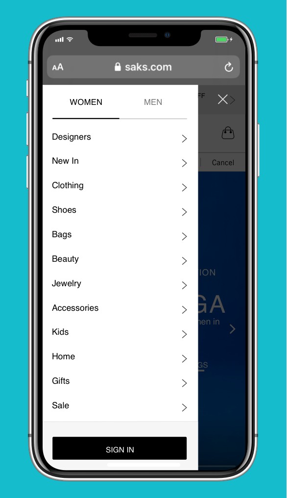
Users expressing have content tailored towards their gender identity.
Shopping on Instagram
65% of our users explore fashion options via Instagram, with 34% following beauty and fashion influencers.
Desktop or mobile?
50% of users complete their purchases via desktop web, with the possibility that the current app experience is lacking.
Relevance
Customers are looking for product recommendations to each user’s individual brand, category, size, price and stylistic preference.
Home page redesign
Mobile Web
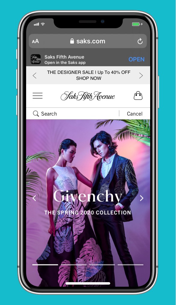
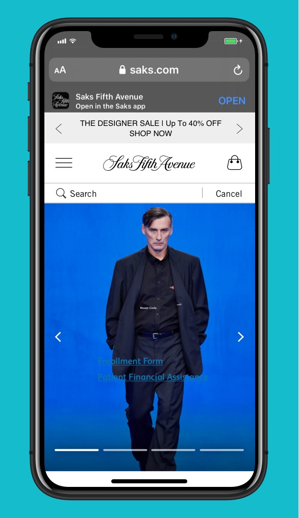
Allowing users to focus on products tailored for them
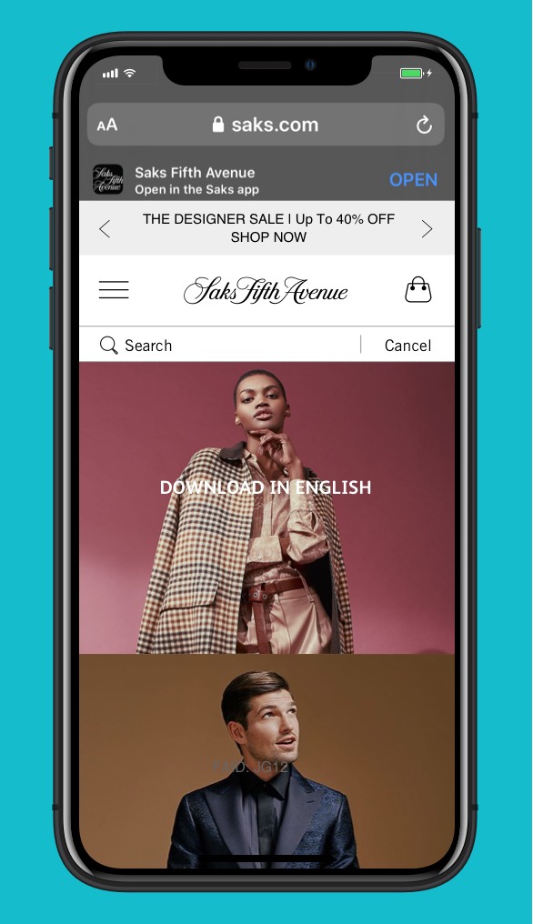
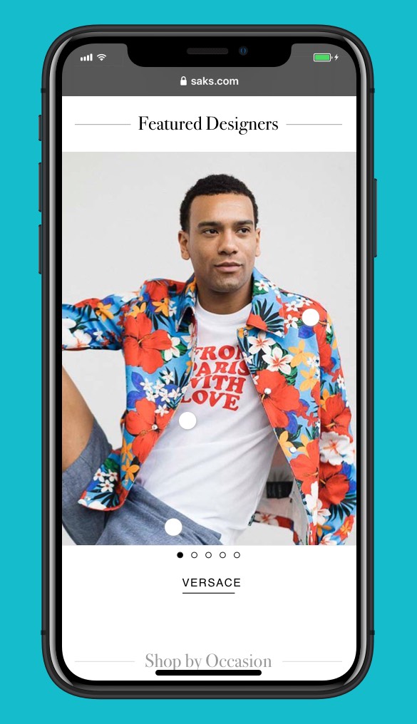
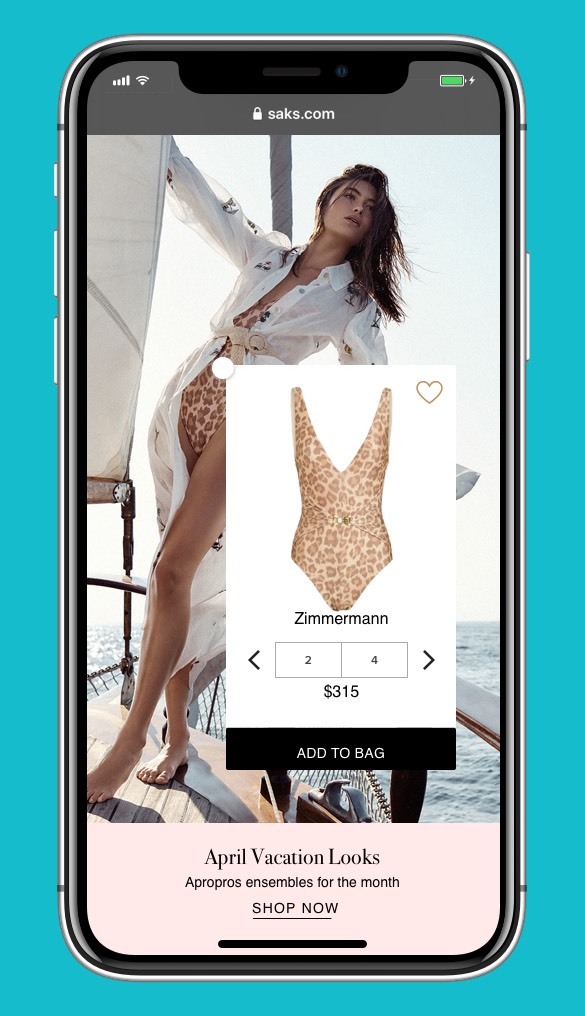
Inline editorial shopping
Home page redesign
Desktop Web
We offered personalized content, based on passive browsing. If customers select certain colors, products, styles, sizes, etc., (based on our product matrix) they would be presented with items they might be interested in purchasing the next time they enter the site.

The results
After 4 design iterations & 2 rounds of testing
Inline editorial shopping: A common practice on Instagram, inline shopping means that users can remain on the editorial page. During testing, users added more items to the shopping bag.
Task perception: Higher percentage of positive reactions, with less clutter, allowing for more browsing time on home page.
What did I learn?: Collaborating with the Brand Marketing team can mean added time to approval processes. We were to present our work with strong decisions, and often to creatives who may not have as much experience with digital. Keeping this narrative in mind helped move the product forward quickly.