
Objectives:
User goals: Putting kids ages 5-10 in charge of their content consumption, where choice and control are paramount.
Business goals: Reinforce brand loyalty for kids' favorite characters in a time where TV may merit an occasional glance from users. Roku devices were popular for families, so we were tasked to strategize improving a broken experience for Cable authentication and improve long and short form video consumption.
Timeline: 4 months
My role:
Collaborated with the UX Lead to create pixel-perfect UI for handoff with the engineering team. I created rich visuals that were AA compliant, and specced the final files with UX Lead for both Nick and Nick Jr.
We presented during touchpoints with stakeholders and Brand Directors to ensure the mockups were reflective of the "kids first" approach.
Success metrics: Higher short form and long form video starts post-launch, and lower bounce rates when authenticating.
The personas
 Gina, 37
Mother of 2 children under 8 years
Gina and her husband own a Smart TV and an iPad 3. Gina appreciates when her youngest, age 6, can occupy himself while she can work at home without interruption.Gina's perception is that she watches TV with her children often, but she uses her phone while they are being entertained.
She works full time, and juggles a busy schedule with 2 children.
 Jakey, 6
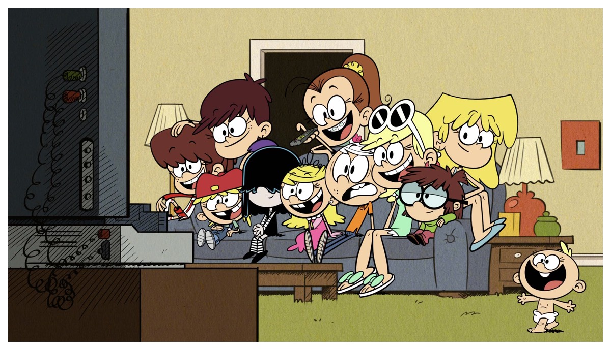
Can't get enough of the Loud House!
Jake's parents have cable, and he is allowed to watch TV on the weekends.He uses a hand-me-down phone, but prefers to be in the living room with one of his parents while enjoying his favorite shows. He needs assistance for updates, and can read simple words.
His dexterity is advanced for his age. He tends to lose focus when watching TV or playing games after 6-10 minutes.
Customer insights
We conducted customer interviews to drive our product development

Findings:
Multitasking while gaming
Kids are used to switching contexts moment to moment (game to game to video to game).
Parents are trying to strike a balance
Parents tend to restrict screen time and push kids to offline activities, with the caveat that they DO want their child to be tech-savvy.
They might not be reading yet
Simplifying choices for younger audiences, and making it AA compliant.
They don’t understand “channels”, just shows
Children under 5 didn't grasp what "Nick Jr." is, but have affinity towards their favorite characters. Network affinity no longer exists with Netflix and YouTube. This presented a huge challenge in the cable network space.
User flow - browse navigation
A guardian can be any older figure. Many families have an older sibling or other caregiver assisting with the "watch" experience, but are distracted, and motivated to teach the child to browse trusted content by themselves.
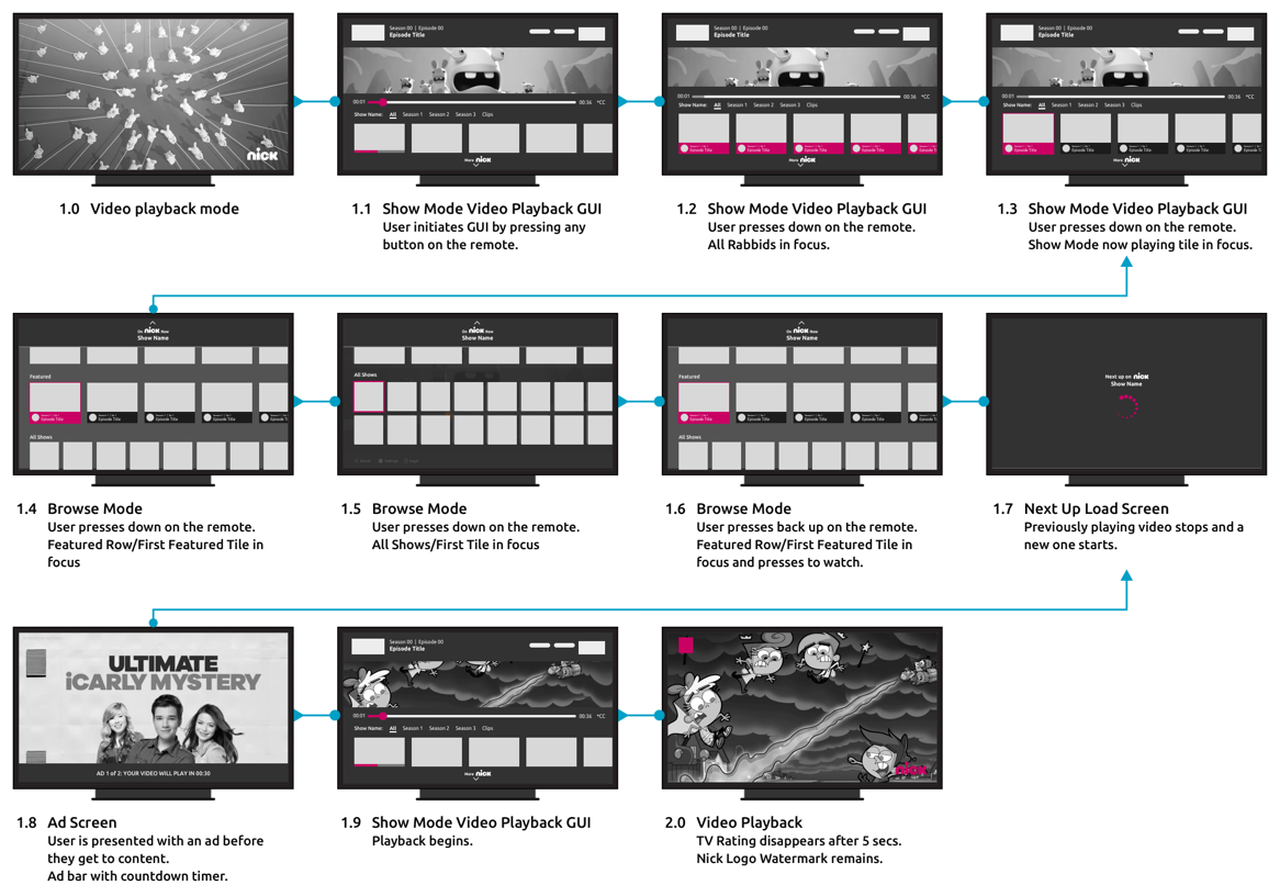
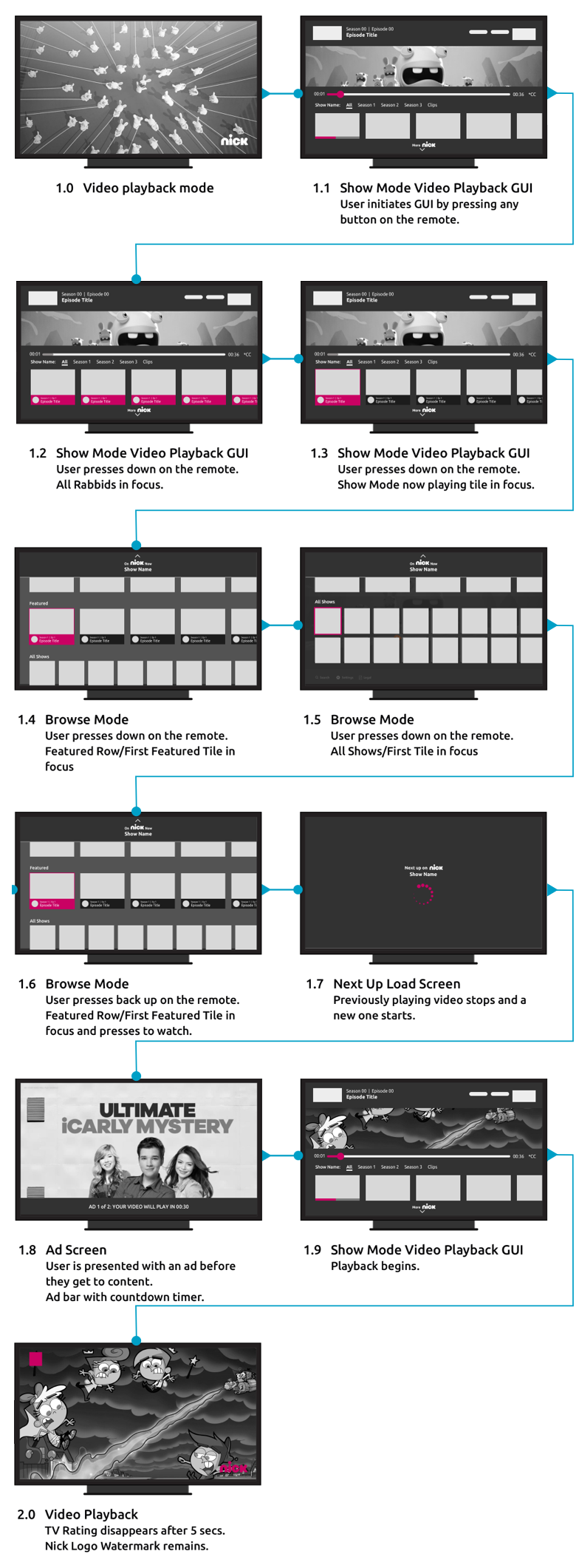
Hi fidelity mockups
Browsing navigation - the first few concepts
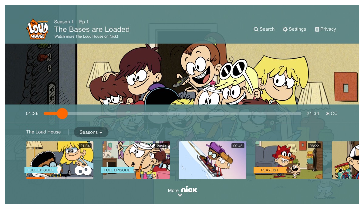
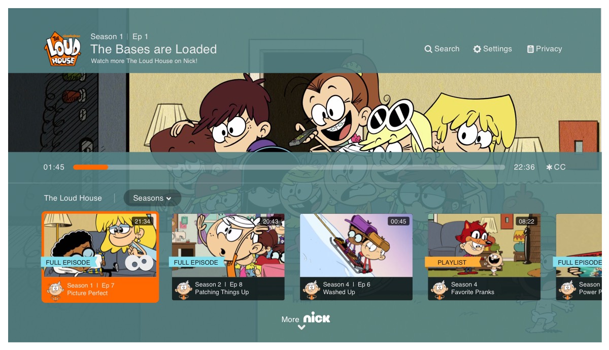
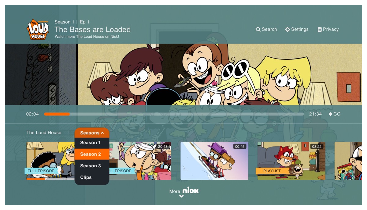
Browse navigation
Rapid prototype-final user testing session
The results
After 6 design iterations & 4 rounds of testing
Bounce rates during authentication: Decrease of bounce rates during authentication process.
New property exploration: No increase in usage or retention.
Short form starts per visit: Increased post redesign.
Full episode starts per visit: Increased post redesign.